The Displacement Tracking Matrix (DTM) is a system to track and monitor displacement and population mobility.
The most up-to-date source of migration data
Migration is a cross-cutting issue relevant to all of the sustainable development goals. The Displacement Tracking Matrix (DTM) is a system created by IOM, the International Organization for Migration, to monitor displacement.
The information housed by the DTM is extremely valuable, though quite technical. In combination with census data (which can often be found on the Humanitarian Data Exchange), the DTM can be used to estimate the population in a given region. When people are on the move, census data becomes inaccurate, yet these fluctuating numbers can be corrected with DTM data. The DTM captures population flows and indicates where people currently are and where they came from. Complementing census data with DTM data can therefore improve planning exercises.
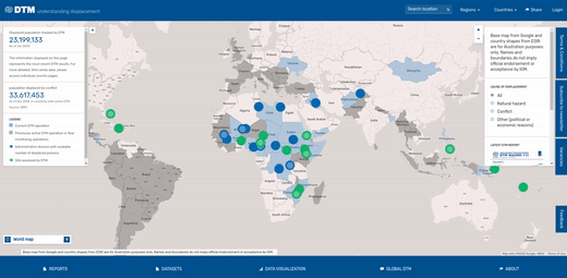
When opening the DTM, you will see a world map with a number of points which represent DTM’s operations, i.e. where they gather data. You can select an operation by clicking on the dot and then zoom in further by selection locations within that country. This will allow you to see how many people have been displaced in a given location.
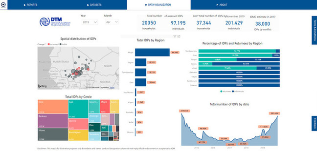
Admittedly, the authors don’t find this very helpful. This initial visualization does not do justice to the wealth of useful DTM data. If you click on the Data Visualization tab at the bottom of the DTM page you can get more detailed information. For instance, a breakdown of IDPs per region that can be filtered by month and year.
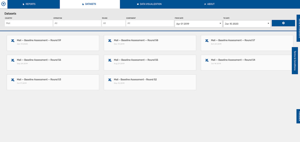
Things get really interesting though when you dive into the raw data by downloading baseline assessment datasets. The downloaded Excel file will give you a wealth of migration data.
The Excel sheet is a monthly snapshot of the migration data and is broken down into a series of rows and columns. Each row in the sheet provides the number of people who are in a given location, and where they migrated from. This migration data is extremely valuable if you aggregate it properly, as it can show you the composition of people who have migrated to a given location.
Some of the migration datasets even provide reasons for why people migrated. This data can be a bit overwhelming to work with - we hope that in the future IOM will update their data portal to allow users to gain a quick overview of: how many people are in a given location, where that population originally migrated from, and for what reasons they migrated.
Migration data resources:
- Raw data - Click on the “Datasets” tab at the bottom of the page
- Interactive dashboard - Click on the “Data visualization” tab at the bottom of the page
- Reports - Click on the “Reports” tab at the bottom of the page