Research and data to make progress against the world’s largest problems… The media focuses on events, Our World in Data focuses on slow but long-lasting developments.
Investigate a world of data stories
If you think of news media as organizations focused on events, then think of Our World in Data as an organization which focuses on researching and quantifying slow but long-lasting developments. Our World in Data then presents these findings in the form of interactive data stories.
Our World in Data presents a compelling argument for examining long term trends as opposed to reviewing event based information:
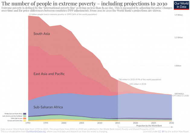
The number of people living in extreme poverty fell from close to 2 billion in 1990 to 0.7 billion in 2015 (see here). On no day in this 25 year period was the headline of any newspaper in the world “The number of people in extreme poverty fell by 137,000 since yesterday”. This is despite the fact that – on average – this would have been an accurate headline every single day during these 25 years.
News outlets today bombard us with information that portrays humanity in globalization in a negative manner (e.g., human induced climate change, war). However, we often overlook important achievements which Our World in Data highlights, such as “Global child mortality fell from 18.2% in 1960 to 4.3% in 2015.”
Our World in Data investigates over 100 different topics ranging from Life Expectancy to Adoption of Technology. All of the topics focus on the world as a whole, thus making it easy to compare countries. The attractive data stories and maps created by Our World in Data uses data that is made publically available. As a result one can use this information in personal research. The data stories are updated regularly.
When searching through Our World in Data we found it easiest to use the research publication button in the navigation bar and then select a theme we were interested in.

Our World in Data is a non-profit entity based entirely on donations. They are funded by organizations such as the Bill and Melinda Gates Foundation , as well as over 200 individual donors. All of their data visualization and code is open source. If you’d like to reuse their impressive charting package, check out their GitHub repository.
Types of data:
- Interactive Charts - The raw data for all of these charts is available, just select a chart and click on the data button below it.
- Data stories - Select a topic you're interested in to see the research